
Funding Societies Investor App
Year
2018
My Role
Product Designer
Type
B2C Mobile App

Summary
Joining as the first in-house product designer in early 2018, I led the redesign of the Investor App to align it with the company’s new brand identity. The project focused on streamlining the onboarding flow and creating a professional, trustworthy interface for peer-to-peer lending.
The 2018 launch of the redesigned Investor App delivered clear, measurable results:
Increased onboarding conversion from 30% to 66%
Earned a high volume of 5-star app reviews for clarity, usability, and confidence
Aligned mobile and web experiences under a unified, trustworthy brand
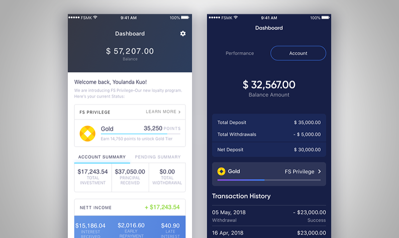
Dashboard 1.0 v.s. 2.0
The Challenge
Following a company-wide rebrand, the Investor App interface felt dated and inconsistent with the website. Beyond visual misalignment, key user flows had grown complex and inefficient over time. Onboarding required too much effort for new investors, and portfolio management lacked clarity for users monitoring active investments.
The challenge was to modernise the app while simplifying these critical journeys, without disrupting existing users or regulatory requirements.
Solution | User Onboarding
Onboarding for regulated financial products is often slow and intimidating due to KYC, AML, and compliance requirements. In the existing experience, users were confronted with long forms early on, creating friction before they could fully understand the value of the product.
The goal was to reduce cognitive load, build trust upfront, and help users progress through onboarding with confidence. We focused on designing a clearer, more supportive journey, introducing two key improvements.
1. Value-led introduction (USPs)
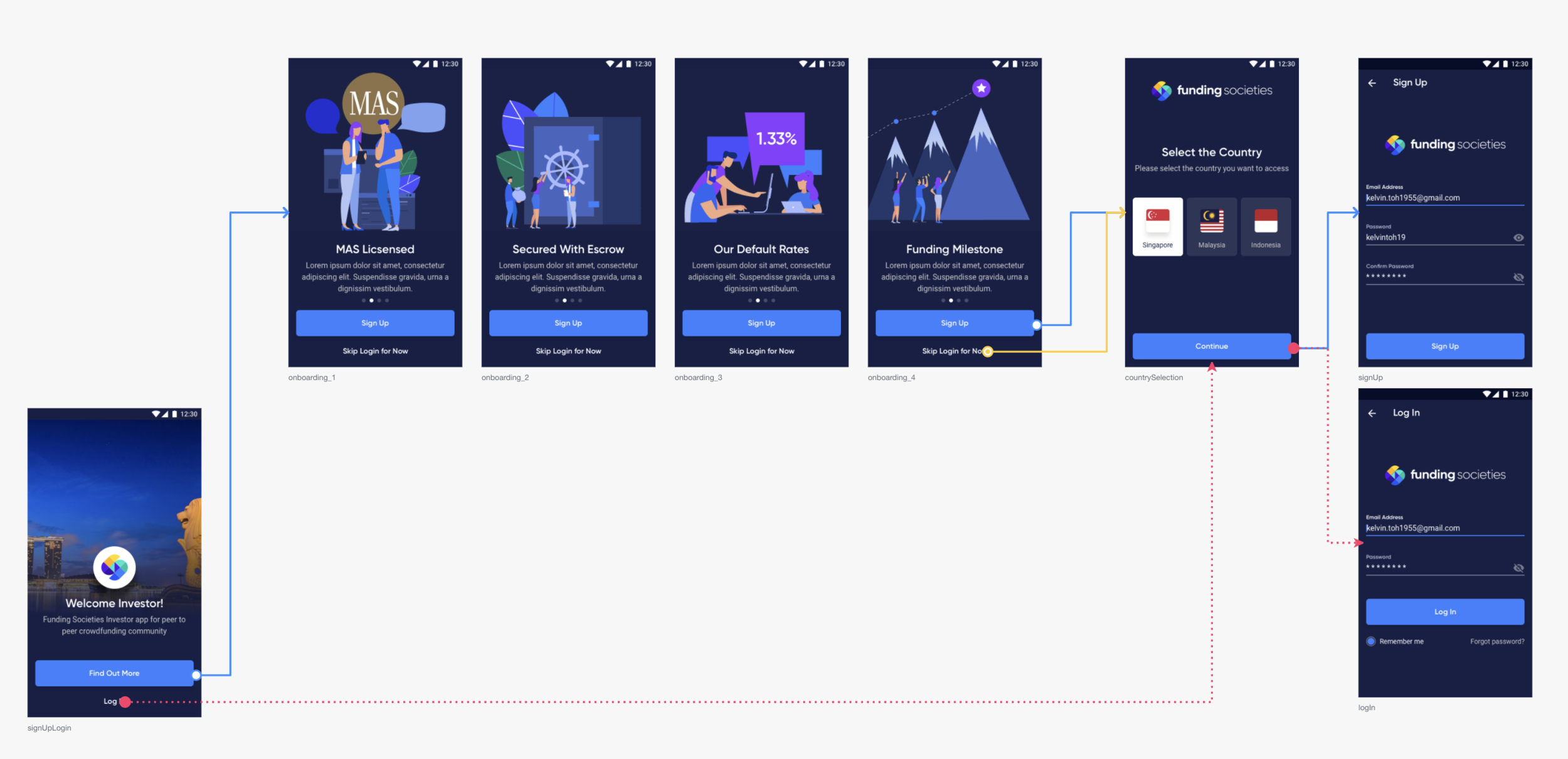
Flow: Onboarding screen to signup/login screen
Before starting the onboarding flow, users are introduced to four clear value propositions of Funding Societies — effectively answering “why choose us?” before asking for personal information. For a growing fintech brand, this step helped establish credibility early and set the right expectations for what users would gain by completing the process.
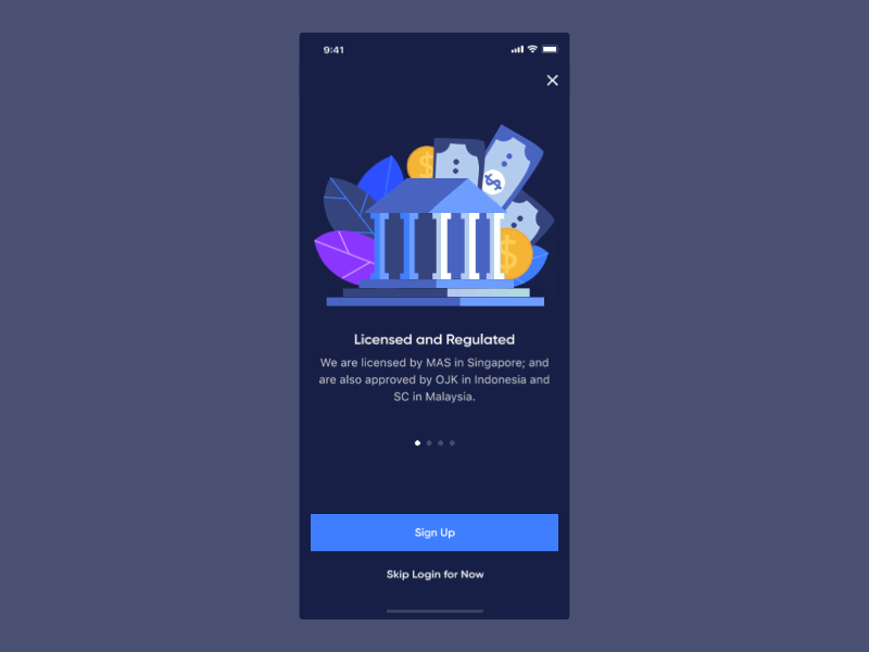
USPs screens in action
2. Guided form navigation
To make lengthy forms feel more manageable, I redesigned field-to-field navigation with a persistent, gesture-friendly arrow control. This allowed users to move through inputs sequentially without excessive scrolling or repeated tapping, while keeping the interface clean and elegant. The interaction reduced friction and made progress through onboarding feel more fluid and intentional.
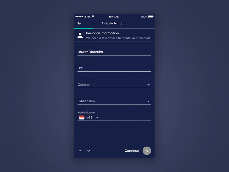
Arrow control interaction in Account Creation flow
Solution | Portfolio Management
For investors, the portfolio view is the primary touchpoint for tracking performance. The existing experience surfaced large amounts of data but lacked clear structure, making it difficult for users to quickly understand their investment status.
I focused on improving clarity, prioritisation, and discoverability through two key changes.
1. Clearer, more purposeful dashboard
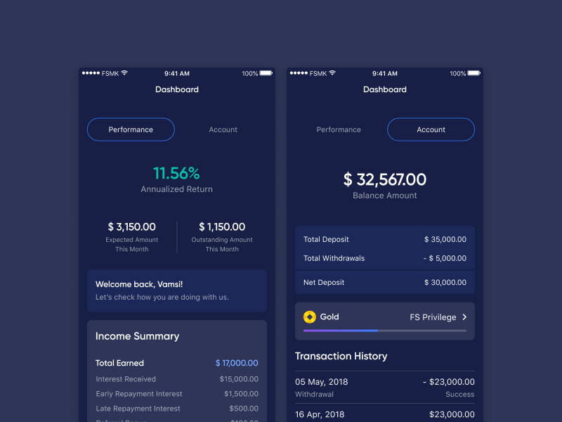
A strong dashboard should not only display information, but guide users toward insight. I reworked the information hierarchy to highlight the most critical metrics first, while grouping related data more logically. Through research and iteration, the dashboard was redesigned to help investors understand performance at a glance.
2. Context-driven portfolio filters
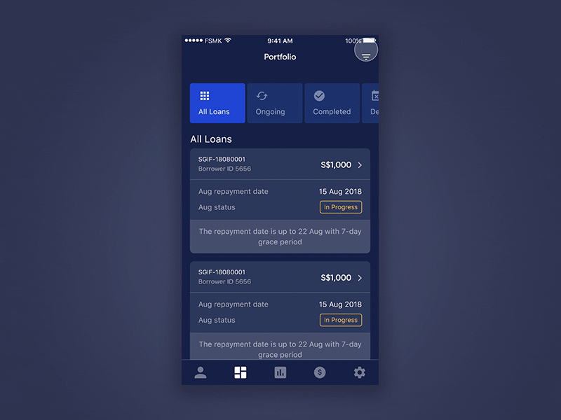
As portfolios grow, locating specific information becomes increasingly frustrating. I introduced a new filter system based on real user job stories, such as reviewing due repayments at the end of the month to summarise performance.
By designing filters around user intent, investors could quickly narrow down relevant items with minimal effort. This made portfolio review more efficient, and aligned with real-world usage patterns.
Closing Thoughts & Customer Feedback
After the launch of the redesigned Investor App, customer feedback highlighted noticeable improvements in visual clarity, usability, and overall experience. Many reviews specifically mentioned the cleaner UI, faster performance, and increased confidence when managing investments.
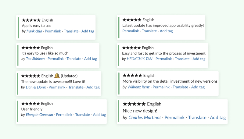
5-star feedback from our users after launching
These qualitative signals were reinforced by strong quantitative results. The improved onboarding journey directly contributed to a significant increase in user sign-ups, with conversion rates rising from 30% to 66%.
While the launch marked a meaningful milestone, it was never viewed as the finish line. For me, this project reinforced the importance of continuous iteration—using real user feedback as a foundation for ongoing improvements in a complex, regulated product environment.